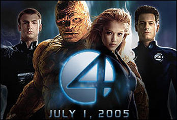
I consider myself kind of well-read when it comes to the issue of comics. Kind of. At least, I read a lot in the 80s and 90s, and know enough about the history of comics to maintain at least a 10 minute conversation with a true comic book nerd. But I admit to never picking up a single issue of "The Fantastic Four" nor watching any of the TV versions. So my question to the more knowledgeable is, has the Fantastic Four logo always been so lame?
Look at that! Did the marketing department just get tired of thinking about a good logo, and instead just went with something they saw watching the news?
1 comment:
Maybe there's just something kind of inherently lame about the number "4". At least with "5" you can go the Roman numeral route with "V," which is pretty cool. Do that with 4 and you've got "IV" which just brings up images of nursing homes.
Post a Comment